Want to add some pizzazz and wow factor to your shots? Well, it's time to dip your toes into the world of color theory! No need to be intimidated by fancy terms like 'complementary colors.' In this article, I will break it down so you can use color theory to take your photography game to the next level.
What is Color Theory?
Color theory is the study of how colors can be combined and used in a visually pleasing way. It's a set of principles for artists, designers, and photographers to create harmonious and balanced compositions. By understanding color theory, you can learn how to choose colors that work well together, create contrast and emphasis, and evoke different moods and emotions in your photos. It's a powerful tool for anyone who wants to create compelling and captivating images.
Although black and white photography has its unique way of portraying emotions, colors help give a lifelike feel to photographs to really bring out people's feelings.
Why Photographers Use Dark Colors?
Dark colors are like the moody teenager of the color world - they're mysterious and sad; but also elegant. You know when you wear all black to a party, and people say, "Wow, you look so chic and mysterious!" That's the kind of vibe that dark colors can give off.
Dark colors are also used to create contrast and drama. Think of a dark stormy sky against a bright green field or a spooky abandoned house shrouded in shadows. Dark colors can add depth and emotion to your photos.

Elegance and sophistication: Dark colors like black, navy, and deep purple are often used in high-end fashion and luxury products to convey a sense of elegance and sophistication.
Mystery and intrigue: Dark colors can also create a sense of mystery and intrigue. For example, a shadowy alleyway or forest can be ominous and captivating.
Sadness and grief: Dark colors can also be associated with sadness and grief.
Why Photographers Use Bright Colors?
Bright colors are like a big burst of energy - they're all about fun, creativity, and happiness. Do you know that feeling when you see a bright rainbow or a field of wildflowers? That's the kind of vibe bright colors can give off. Bright colors can make you feel happy and optimistic. They're perfect for creating a playful and cheerful mood.

Joy and optimism: Bright colors like yellow, orange, and pink can evoke happiness and positivity. They also produce a sense of playfulness and cheerfulness.
Warmth and passion: Bright reds and oranges can evoke a sense of warmth and passion. These create a sense of excitement and energy.
Attention and visibility: Bright colors draw attention and increase visibility.
What is Hue, Value, and Saturation?
Color is wild because one color is never always one exact shade. There are hundreds of shades of blue. In digital photography, we break down color by hue, value, and saturation to try and simplify color.

Hue
Hue refers to the pure color of an object or light source, independent of its brightness or saturation. Hue is the pigment of color.
Every color in the visible spectrum has its unique hue, ranging from reds and oranges to greens and blues - and everything in between. They can be adjusted using tools like color balance, hue/saturation, and selective color to fine-tune the colors in their images.
Value
Value is the brightness or darkness of a specific color hue. Let's say you have a pure red hue, and you increase its color value. It will become lighter or brighter. On the flip side, if you decrease its color value, it will become darker or more muted. The color value will affect the mood and tone of an image.
During post-processing, the color value is adjusted using tools like curves, levels, and exposure.
Saturation
Last but certainly not least, saturation is the degree to which a color is pure or diluted with white, gray, or black.
A highly saturated color is pure and intense, while a desaturated color is more muted and subdued. For example, a bright, pure red is highly saturated, while a pinkish-red mixed with white is less saturated. Saturation can be adjusted using hue/saturation, vibrance, and selective color.
Related article: What is Saturation in Photography?

Creative Ways to Use Color in Photography
Bold Colors
Look for subjects that are naturally colorful, like flowers or street art. Then, think about how you want to frame your shot - you'll want to create a balanced, harmonious image with the colors placed just right.
You can also use color contrast to make your bold colors even more striking. Try pairing bright red with deep blue or yellow with green. During post-processing, you can bump the saturation to make your colors even more vibrant but stay moderate, or your photo could look fake.
Remember the lighting! Shooting during the golden hour can make your colors really pop, or you can experiment with artificial lighting to create bold and dramatic effects. The most important thing is to have fun and play with different techniques until you find what works best for you!

Pastel Colors
Give your photos a soft and dreamy vibe with pastel colors. They work best with delicate and gentle subjects, like flowers, sunsets, or babies. Use soft and diffused lighting, like during the golden hour or on an overcast cloudy day. Please avoid harsh lighting, or it'll wash out the colors.
Mix and match different pastel colors to create a soft and sweet vibe. Try pairing soft pink with light blue or lavender with peach.
Adjust your exposure to get the right effect - try underexposing a bit to keep the colors from getting washed out or overexposed for a light and airy look.
Please don't overdo your photos with saturation, contrast, or exposure when editing them. After all, you don't want your image to look like a unicorn sneezed on it!

Monochromatic Colors
Monochromatic photography is all about using variations of a single color to create a calm and cohesive look. It's like making a rainbow with just one color!
To start, you need to pick your color. It's a good idea to choose a prominent color in your frame. For example, if you're taking a photo of a big blue sky, you should use different shades of blue.
Now, it's time to get creative! Look for areas of your subject that are naturally darker or lighter, and use these variations to create depth and interest. You can also play around with your camera's white balance settings to create different effects.
After you've taken your photos, it's time to edit them. You can enhance the monochromatic effect by desaturating the image, boosting contrast, or using a color filter. Just be careful not to go too crazy with the edits - you don't want your photo to look like it's from another planet!

Highlight a Color
If you want to highlight or emphasize a colored subject in your photo, there are a few things you can do:
- Use a contrasting background that can help your subject stand out. For example, if your subject is red, try placing it against a green background.
- The way you compose your photo can also help highlight your subject. Try placing your subject off-center or using the rule of thirds to draw the viewer's eye to your focal point.
- Lighting can make a big difference in highlighting your subject. You can use a spotlight or directional lighting to draw attention.
- A shallow depth of field can help your subject stand out by blurring the background. This technique works exceptionally well with close-up shots.
- Finally, you can enhance the color of your subject in post-processing. You can boost the saturation or adjust the hue to make the color pop.

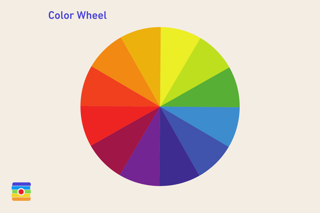
Using Complementary Colors
Using complementary colors is like bringing together two best friends who are total opposites - but they mesh well! You know how blue and orange are like yin and yang? Or how red and green are like the peanut butter and jelly of colors? That's what we're going for here!
First, you want to pick your complementary color pair. Next, you want to decide which color will be the show's star and which color will be the supporting actor. Then, it's time to have some fun with it! Experiment with different shades and tones of the colors. Do you want a bright, bold look or something more subdued and moody?
You can also use complementary colors in the background of your photo.

Experimenting with Color Temperature
When experimenting with color temperature in photography, you're playing around with the warmth or coolness of the colors in your image. It's like adding a filter to your photo, but instead of making it look like it's from the '70s, you're adjusting the vibe of the image.
So how can you experiment with color temperature? One way is to mess around with your camera's white balance settings. Do you know that little "WB" button on your camera? Give it a press and see what happens! Depending on your mood, you can make your photos look warmer, cooler, or funky.
Related article: Kelvin Color Temperature - Color Temperature Chart

Using Natural Light
Another way to experiment is to use natural light. Mother Nature loves to mix it up, so try taking some photos during the golden hour, when the light is warm and golden, or during the blue hour when the light is cooler and bluer. You might be surprised at the different moods you can create with just the sun and some clouds.
If you're feeling extra fancy, you can mix different light sources, like indoor and outdoor. You can also try using lighting gels, like little pieces of colored cellophane that you put over your lights to create different colors. It's like a party in your camera!
Finally, if you want to fine-tune the colors even more, you can mess around with the color temperature sliders in your editing software.
Related article: How to Use Natural Light?
Whether you're into bold and bright colors, soft and pastel hues, or moody and monochromatic tones, there's a whole world of color to explore and experiment with.
Play around with your camera's settings, experiment with different light sources, and go wild with your editing software. Photography is all about capturing the beauty of the world around us, and what better way to do that than by using the power of color? So get out there, snap some pics, and have fun with your colors.
Related article: What is Emphasis in Photography?
Related article: Photography Composition Techniques
Related article: Everything Looks Better in Black & White – Tips for Better B&W Photography
Related article: Beginner’s Guide to High Contrast Photography
Related article: What is Saturation in Photography?