The photos you take of food have to look as good as the meals themselves because when done well -- or well-done -- a snapshot of your favorite dish not only inspires hunger pains but also appetizes chefs, photo-enthusiasts, and cookbook publishing companies alike.
While general knowledge of photography comes into play, there's a specific set of skills that help you aim your lens toward the yummy aspects of life.
We've put together a list of ingredients for you; tips will help you start salivating for the unique food photography experience.
The first thing to wrap our heads around, which feels a little strange, is that sometimes things look best when they don't taste their best.
If you've ever seen a commercial for a fast-food restaurant, you know what I mean. Like everything else, marketing food photography is designed to capture the attention of your target audience, and your photo should make the food look its absolute best -- even if it's not exactly how the consumer will be… well, consuming it.
Thankfully, your viewers won't be eating your photographs (we hope). Just make sure you're prioritizing the styling of the plate, which sometimes means:
- Filling out your spread
Adding small platforms which raise certain food items above others makes for a layered and dynamic-looking dish. Adding garnish also helps with texture, color, and space. A packed dish is essential, also referred to as a "full-bodied" food shot.
- Get it while it's hot!
Food often "deflates" when it cools. Make sure you're ready for your photoshoot as soon as the food comes out of the oven, ensuring it looks as savory and juicy as possible.
The next thing to think about is color. Depending on the dish you're photographing, the bold color could be inherent to the food itself, or it's something you might have to add as a way to strengthen the overall visual experience of your picture.
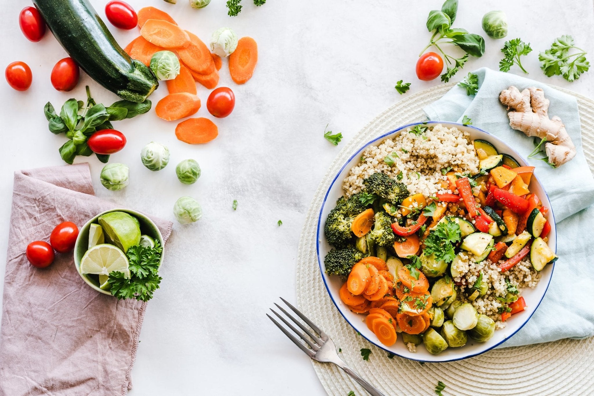
First, make sure the food -- colorful or not -- looks its best. If it should be golden-brown, double-check it is. After that, consider adding colorful garnishes that add contrast and vibrancy to your image. Have a working knowledge of complementary and contrasting colors before experimenting, always remembering that scrumptiousness is paramount.
Next up is what's surrounding your food. The setting of your photograph is a crucial aspect of making your dish and photo look its most delicious. A properly designed and executed surrounding goes a long way in conveying context and mood. Is this meal one that will be enjoyed in the middle of a candlelit 5-star restaurant? Are you trying to accentuate the skills of the mastermind behind the food, thus placing your shot in a slick and silver kitchen setting? Or are you isolating the dish for cleanliness and uniformity?
Make sure you're incorporating each step and combining them throughout your approach so that they're working together for the best shot. Think about the color of your surroundings and make sure they don't clash with your main focal point -- the food.
Working hand-in-hand with setting and color is what "surrounds" your meal. You can use food or restaurant-themed props to create a foreground and background that gives your photography depth. When appropriate, consider showing off some of the ingredients used to make the culinary marvel. If you can tell a story with your image, it'll help draw the viewer in and make your picture more than just Instagram food exploitation.
One of the most essential ingredients for food photography (and all other photography) is how you light the plate. Also, as with the raw materials that make up your dish, the quality of light is critical. The good news is, a plate is usually portable, so you can have significant influence over how and where you light your photo.
Some major approaches include:
- Natural light
If your location provides abundant light, use it to give the food a natural and vibrant appeal. Just remember, "Natural" doesn't always mean unmodified. Since a plate of food often offers a wide variety of shapes and angles, feel free to bounce some natural light back onto the dish with a reflector. You want to avoid unflattering shadows that hide or obscure attributes that make your viewer want to scarf down your subject in a flash.
- False, or Artificial Lighting
In addition to bringing a traditional 2 or 3-light set-up to your location, one of the most popular ways of lighting a single plate of food is a Light Box or "Pop-Up" studio. These self-contained boxes are easy to assemble, come with their own LED lights, which throw a perfectly even light from all sides, and provide a variety of simple but effective backgrounds -- colors that really make your food stand out.
Last but not least, use your camera the way the butcher uses his knife.
Pick a flattering angle, one that either reveals the entire dish or advertises a meal's most appetizing aspect.
After that, smartly use a wide aperture, causing a shallower depth of field that zeros in on the thing that makes the stomach grumble above all else.
Once you follow this recipe, you'll be ready to create a visual menu of delights.

